Most people write a great official email. The subject line is striking, the body perfect. Yet when it comes to the sign-off, it’s so basic it leaves no impact whatsoever.
Are your emails suffering from the same ailment?
While we put great stock in first impressions, the last impressions can get neglected. But if you are any kind of a movie buff, you know that the entire thing sometimes may rest on the ending. Don’t believe us? Recall the end of The Game of Thrones.
In this article, I’ll cover how great visuals help you save your emails from a forgotten fate. Learn how to harness the power of visuals to create an email signature that maximizes your brand message and leaves people wanting more.
What is an email signature?
It’s an official sign-off at the end of your emails that gives readers essential information about you (or your company).
It involves the usuals such as
- Your Name — Your first and last name. People have started adding their preferred pronouns too.
- Your Designation/Profession — Your position with the company if you are emailing on your company’s behalf, or your profession if you’re self-employed.
- Your Company/Business — Write your company name where you’re employed or the business name you run.
- Your Address — This is where you will receive your official mail. Skip this part if you are a freelancer, but keep it if you run any other kind of business as it lends credibility to the signature and sender.
- Phone Number — Do add your country prefix if you have an international customer or supplier base.
- Email Address — This is too self-explanatory, isn’t it?
- Social Media Buttons — Hyperlink these buttons to take readers to your official online pages on Facebook, Instagram, and LinkedIn. These links can help you get maximum exposure.
What makes a good email signature?
Two key details create the most impactful email signature.
- Only the most essential info is included.
- Further engagement is invited through strategic CTAs.
Short, crisp, and intentional email signatures ensure your reader retains the information and isn’t overwhelmed with useless buttons and details.
For the most efficient email communication, create multiple versions of your email signature so you can send the most suitable one to the right receiver.
Expressive visuals that uplift your email presence
Figure out what works for your audience, brand, and industry and then only use those. But below is a comprehensive list so you know the broad variety of options you have at your disposal.
-
A nice and clear headshot
Give a face to the message by including a clear headshot in your email signature. Ensure the image is professional and not a selfie. Don’t be afraid to use a friendly smile.
Make your headshot a part of all your email signatures to personalize the message and build trust with your peers and customers.
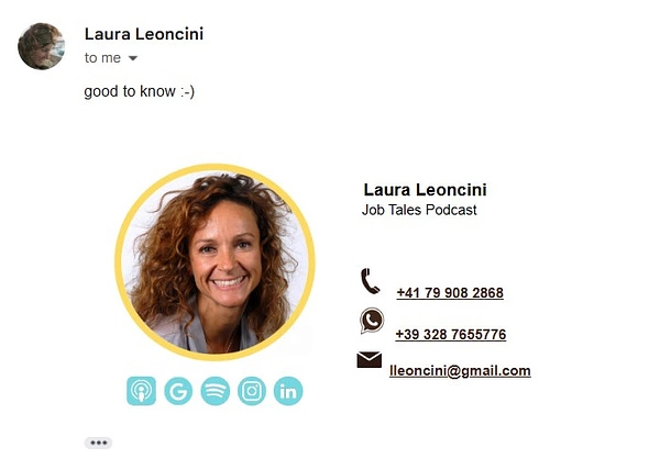 Image: https://dribbble.com/shots/21892769-Client-s-Email-Signature-Design
-
Your company logo
Raise your brand awareness by including your company logo in the email. To avoid loading issues, use compact logo sizes. A 200x200px logo is good.
For new emails, use your full logo version — icon plus the company name. Reduced versions of the logo such as icon-only or text-only are ideal for replies. The same rule applies to company-wide emails. You all know the company you work for, so stick to a simper email signature when talking to each other.
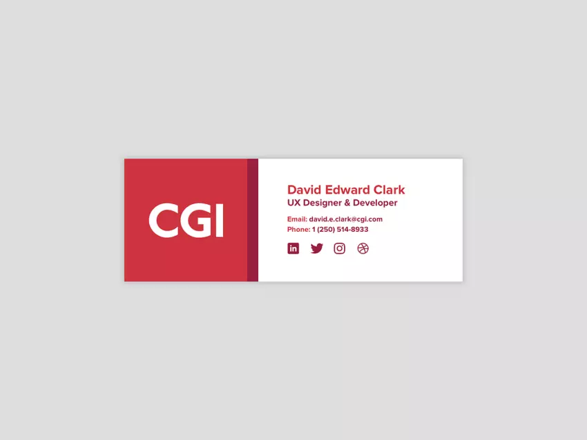 Image: https://dribbble.com/shots/5608375-Email-Signature-for-CGI
-
An image gallery
Your communication with a potential client doesn’t have to end with the email sign-off. Use your signature space to include links that direct them to your online galleries, work profiles, freelance accounts, etc.
If you are a realtor, show off your newest listing; if you are a creator, advertise your work; and if you are selling, market your choicest products.

-
Buttons directing to your online portfolios
Take your marketing into your hands and insert your portfolio links into your email signature. That way you make sure that when people want to look you up online, they can just click on those handy buttons and see what you have to offer.
-
Motion graphics and animation
Motion graphics are not only quick tools to keep people hooked for a few seconds longer, but you can also use them in your email signatures to show off your personality, share a little something about your brand, or even as a bit of delight factor to the communication.
 Image: https://dribbble.com/shots/4459278-Email-Signature-Animation
-
Appropriate greetings
Handwritten signatures, messages of seasonal greetings, or a unique way of saying goodbye (that’s unique to you) help you personalize your emails and leave a lasting impact.
 Image: https://dribbble.com/shots/17826545-Creative-Email-Signature-Design
-
QR codes for a fuller email signature
QR code helps you keep your email signature on the minimal side. While the signature under the email can contain only the essentials, the QR code can lead a reader toward more information — such as your creative portfolios, more ways to connect with you, confirm an RSVP, or even a discount code.

-
Video email signatures
If you run a video channel or use it as one of your key marketing platforms, adding a video thumbnail under your email signature can help you generate leads, and increase your online views and brand reach.

-
Campaign banners
Adding campaign banners in email signatures helps keep your customers up to date with the newest offers and announcements. Run them in tandem with your other marketing campaigns for the most efficient results.

-
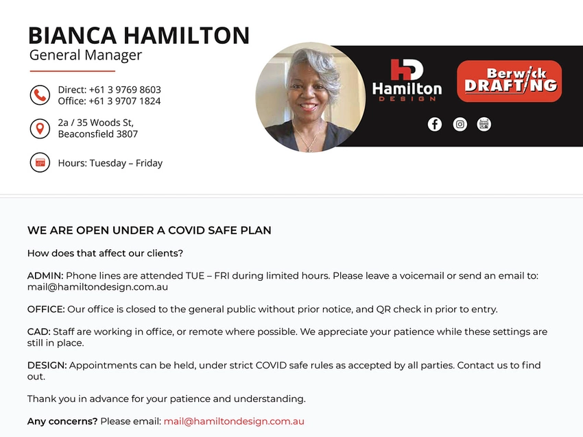
Legal or administrative information
Businesses might want to include a legal disclaimer or additional information about a current topic in their official emails. Things like COVID-19 safety instructions or confidentiality announcements often go under email signatures.
Best practices for visually optimized email signatures
With so many graphics and visuals to work with, how do you determine which one to use and when? Below is a concise list of industry best practices for enriching your email signatures with the most appropriate visual details.
-
Use only the most necessary information
I have already covered it but it bears repeating. Don’t stuff your email signature with 13 different ways for your clients to connect with you. Use only the details that matter. Brevity will not only ensure information retention but also make communication more productive.
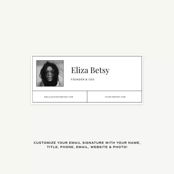 Image: https://www.pinterest.co.uk/pin/625648573241694290/
-
Communicate your brand personality
Every detail in your signature — overall theme, colors, fonts, the style of headshot you’ve chosen — must represent a full and cohesive picture of your brand.
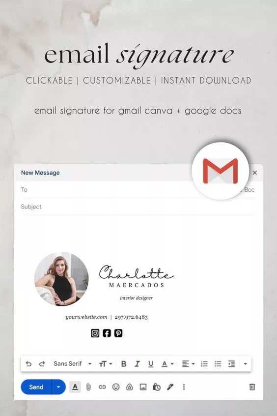 Image: https://www.pinterest.co.uk/pin/937382109927361073/
-
Use descriptive icons
People often use letters to indicate the type of information presented in the email signature. For example, an E for the email address or an M for a mobile phone number.
But with so much text already on the signature, it can start to look cluttered quickly.
Shatter all this noise by sticking to graphic icons to represent these details. A mobile phone icon or an envelope icon does the job fine without overwhelming the reader. Icons are also more descriptive than letters and more familiar to online audiences. Image: https://dribbble.com/shots/23334132-Email-Signature
-
Apply hierarchy
Like any other piece of visual design, hierarchy will play an important role in guiding the user’s eye across the signature in an organized order.
Employing different sets of font styles and sizes helps you achieve a natural progression in design, so the reader can identity primary information from the secondary. You can also use color to as an additional tool to emphasize hierarchy.
 Image: https://dribbble.com/shots/18877836-Gray-Email-Signature
-
Utilize a small color palette
Be intentional about your color use and limit your color palette to a maximum of 2 or 3 in the design. The wisdom behind a smaller color palette is that it will prevent you from selecting shades that compete with each other and increase the cognitive overload for the reader.
Take colors from your logo design so the colors look thematic and there’s consistency in the overall email signature.
 Image: https://dribbble.com/shots/17638569-Static-email-signature
-
Use just one or two fonts
The rule of scarcity in colors applies to the fonts too.
Take advantage of a versatile typeface — with multiple styles, weights, and sizes — and use it to highlight and differentiate information in the signature.
In the example below, both the color palette and the font mix are minimal, yet the effect is a detailed design with no essentials missing and no hierarchical issues.
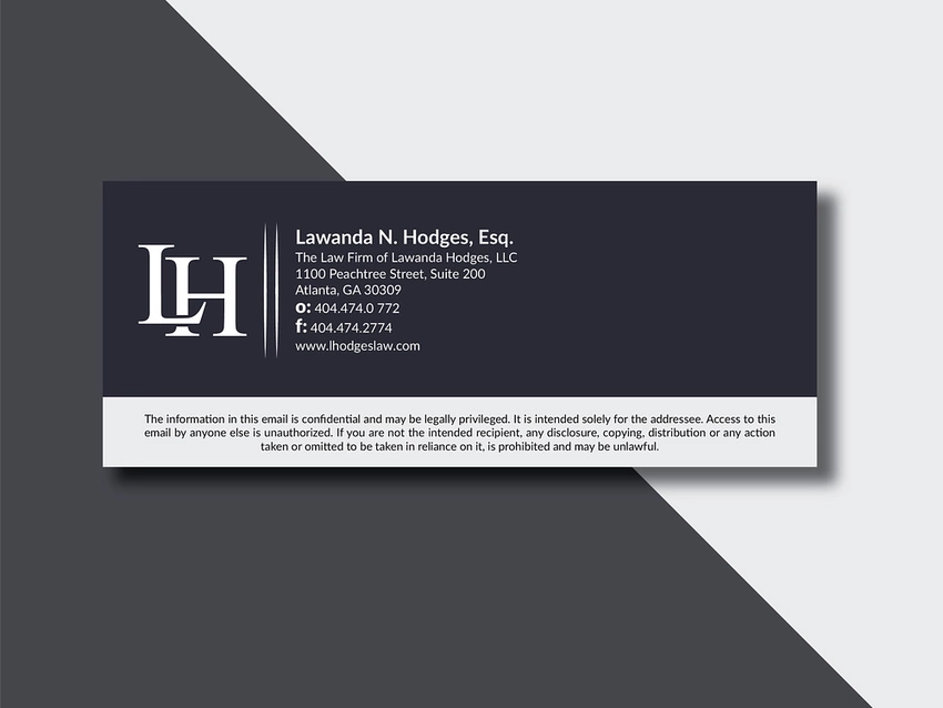 Image: https://dribbble.com/shots/17182489-Clickable-Email-Signature
-
Employ dividers to compartmentalize information
Make your email signature look even better by adding separators and dividers.
A large red bar in the following example creates a neat design by separating the logo design from the rest of the signature. Smaller bars within the design separate the four countries from each other. With color and font size variations, the information looks even easier to process.
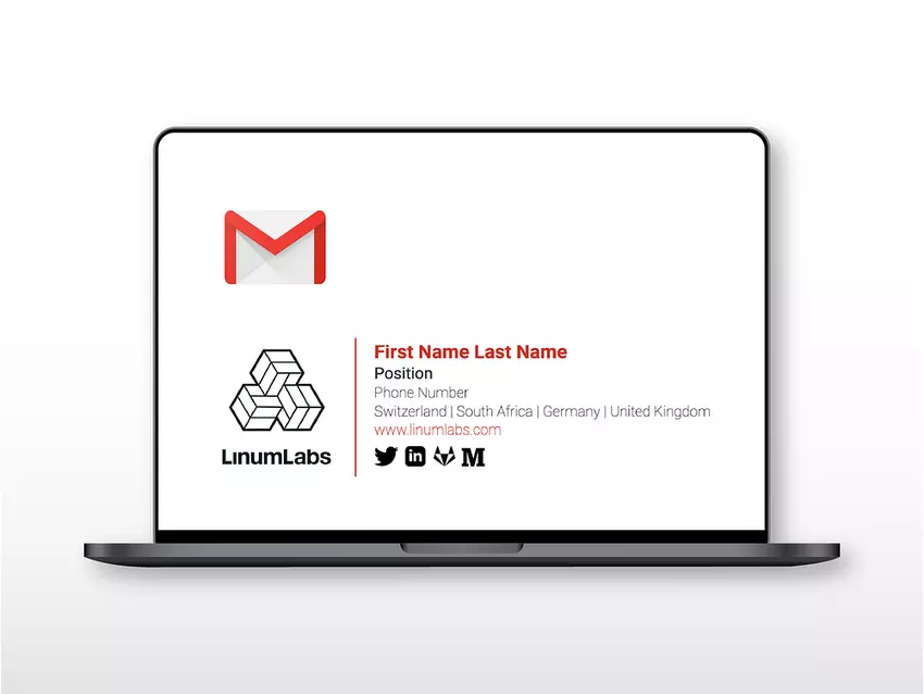 Image: https://dribbble.com/shots/14146977-Linum-Labs-Email-Signature
-
Must add a clear CTA
Forgive me if I sound like a broken record, but you have to make 100% sure that everything you add to your signature is there for a particular reason. Most importantly, your CTAs.
While you may want to add a few in there to make sure you have something for everyone, the truth is you are overdoing it and you may be turning your readers off.
Make things easy for them. Use one CTA per signature and keep it simple. Choose a call to action that’s more pertinent to your strategy at that time and make your signature all about it.
 Image: https://dribbble.com/shots/20498981-Email-Signature
-
Put a tracker on all links and buttons
What good are your CTAs and social media buttons if you aren’t tracking them?
Put trackers on all your links/buttons/icons on social media so you know how they are performing in your emails. Do people actually care about them? Is one getting more attention than the others?
Use a few signature versions for A/B testing and find out what works best — and that’s only possible with link tracking.
-
Match your audience and industry preferences
Email signatures for a first-grade teacher, a Harvard professor, and a TikTok influencer are going to have very different visual flavors.
Match your email signature visuals to your audience and industry preferences so your customers can relate to you and have confidence in what you are offering.
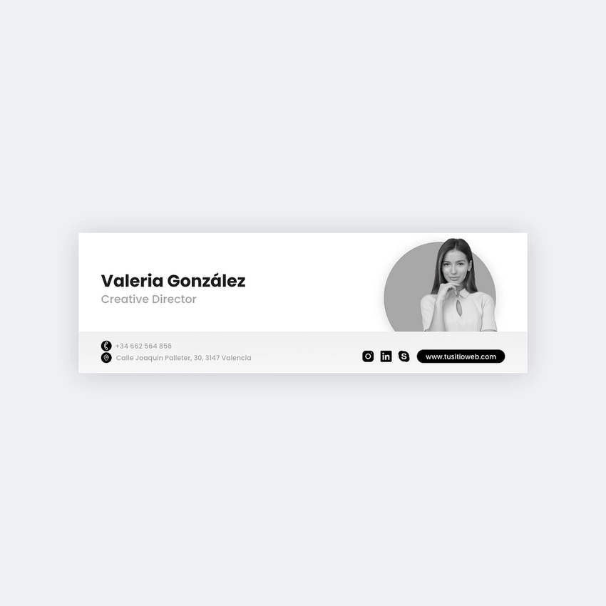 Image: https://dribbble.com/shots/23357659-Signature-Email-Design
-
Add alt-text if including any images
Ideally, your email signature needs to be in HTML so you don’t suffer from any image loading failures. Yet, if you are using any images in your sign-off, don’t forget to add alt-text for each of them.
Alternative text is the descriptive text that shows up in place of images when they fail to load. It contains a description of what the image is about, improving accessibility of the message.
-
Optimize the signature for mobile
More than half of your email receivers are going to see it on their phones. Optimize your email signature to fit the cramped spaces of tablets and smartphones so you never leave anything important unsaid.
 Image: https://www.pinterest.co.uk/pin/327214729189079606/
-
Make the social media buttons stand out
A few things to keep in mind when adding social media buttons to your email sign-off.
- All of your social icons must be in uniform file sizes for optimum load and viewing.
- Use a universal file format to ensure the icons are compatible across the board.
- PNG and JPEG are your best options.
- Do not use the entire rainbow for your social icon colors. Keep all of them in a single hue for consistency and harmony.
Click here for a quick link to a huge variety of social media icons to add to your signatures, courtesy, Exclaimer.
-
Tailor the signature for the dark mode
Protect your email signature from losing its shine in the dark. When your recipients have enabled dark modes in their browsers, stand out from your competitors by having an email signature that responds to all these environmental changes.
Select colors, fonts, and contrasts that allow you visibility in both the light and dark to ensure your customers can always find you no matter the surroundings.
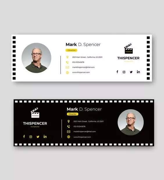 Image: https://www.pinterest.co.uk/pin/293296994492682291/
Conclusion
So, there you have it — a low down on all you need to know to get the maximum out of every type of visual you use in your email signature.
Just remember to make intentional choices so every detail serves a function. Design without purpose is empty aesthetics which is just lazy and rude.
Spend time to understand your brand, industry, and audiences, and make choices that’ll mean something to you and your email recipients.
Author: Karla Hogan
Bio: Karla is an accomplished writer and blogger with a degree in marketing. With over 5 years of experience in writing strategic content, she has worked with startups and founders, helping them to develop and execute effective content strategies that deliver results. Karla is known for her ability to craft compelling content that resonates with readers and drives engagement. She has a keen understanding of the power of storytelling and how it can be used to build brands and connect with audiences.
In her free time, Karla enjoys reading and knitting. She also has two pet cats called Salt and Pepper, who keep her company while she works on her latest writing projects. With a passion for all things creative and a dedication to excellence, Karla is committed to helping others achieve their goals through the power of effective content marketing.