
Website content presentation not only needs to be aesthetically pleasing but it also needs to function perfectly across devices and provide a great user experience.

The number of mobile devices used to access the web has grown considerably. The amount of time spent using digital devices has increased across every metric while time spent using desktops has decreased considerably. Today, the design of many websites is influenced by this evolution. One of the challenges is to achieve a balance between technical and aesthetic considerations.
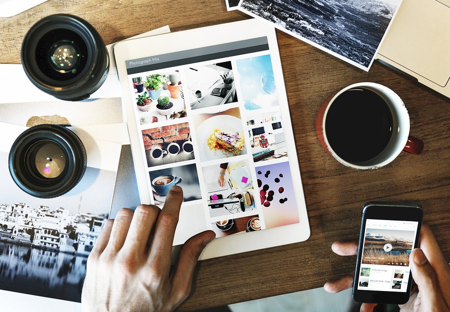
Multimedia content
The list of content types keep growing, and if you don’t understand what works when, you’ll lose out. A carefully tailored copy is being enriched with video, charts, graphs, infographics, sound and more. This trend is not new, but it is evolving all the time. Using multimedia, it’s possible to turn complex material into more digestible chunks.
Personalized content
Perhaps you’ve visited a landing page and entered your name and email to download an eBook. Imagine your surprise when the next time you visit the site, you’re greeted by name and shown to more eBooks related to the same topic.
It’s as though you’re at your favorite restaurant and you’ve been greeted by name and ushered to your usual seat. Personalization provides a more intimate experience for users.
Sub-niche or in-depth content
With more content being created than ever before, it either has to become more niche or more in-depth and creative to stand out. Businesses continue to identify underserved sub-niches in their industries to attract attention.
Bite-sized content
The average length of blog posts has been rising steadily over the past few years. Longer content ranks better in SERPs and businesses want to rank highly on that all-important first page.
Social networks also drive a lot of traffic – more and more by the year. This is why a mix of various types of content, including bite-sized content, is important. Bite-sized content often performs well on social media.

Content will adapt to natural language search
Technologies such as Siri and Alexa allow consumers to interact with content in a call-and-response format.
Voice searches make up to 20% of all searches on Google from mobile, and young people are more likely to use it. Content will start focusing on answering questions in the same way as a human being. Consider using longer, naturally phrased keywords to suit the conversational nature of voice searches.
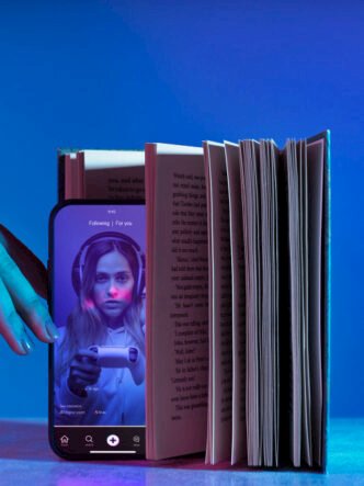
Video content still rules, especially live video
More of a marketing budget than ever will be devoted to creating video content. Currently, the vast majority of consumers would rather watch live video than read a blog post. For live video, all that’s necessary is a smartphone with a decent camera.
People are hosting live Q&As, live interviews and live streaming trade shows and conferences to give people the feel of what it’s like to be there.
Layouts – clean, simple and broken grid
One of the prevalent trends in 2017 and 2018 has been simple, clean layouts. Sidebars crammed with buttons, ads and other clutter have given way to a more streamlined approach.
The shift towards mobile means densely packed sidebars can influence speed and performance. The design must look great and still work well, even on small screens.
Broken grid layouts are a new trend. They don’t do away with the concept of the grid altogether — but images and text elements drift into and across the gutters. As boxes of text and images start to converge and overlap, unexpected juxtapositions are created.

Fonts – font pairings, more serifs, and variable fonts
A huge variety of typefaces exists today, and knowing which ones will be most successful on your website can be challenging. Font pairings, a technique of combining very different but complementary typefaces has been a huge trend and is likely to continue.
More serif fonts are being used. In the past, sticking to sans-serif fonts made sense due to various factors, such as the type of screens. As font-rendering technologies and screens have improved, more elaborate fonts are being used successfully. Serif fonts are stepping up, with their ability to evoke a sense of refinement and elegance.
Developing variable fonts is a joint project undertaken by some big names like Apple and Adobe. To describe these fonts simplistically – a variable font is a single font file, but it can behave like multiple fonts. For example, it may be able to go from thin to thick in an instant.
Images – illustrations and hero images
Illustrations are gaining new prominence. They have the ability to powerfully bring more abstract concepts to life. They also leave out certain detail which makes it easier for viewers to identify, rather than if a photograph of a specific person was used.

Dropbox uses illustrations very successfully – rough sketches are paired with abstract, colorful shapes. Shopify uses a single drawing on the Polaris site to illustrate an abstract concept. The drawing clarifies that the design system is like a guiding light for each team member.
A hero image: A prominent trend that continues to increase in popularity is the use of a hero image. A hero image is one that’s visually striking and can form the foundation for a whole design. A single large image works particularly well on sites that use plenty of high-resolution images, such as food blogs.
The header photographs directly relate to the content and give a more in-depth view of the page.
A photo gallery or photo slideshow: If you have a site where you upload photos in quantities, organizing them in a photo gallery works well.
A photo slideshow is another option that can work well on certain websites, such as a wedding or photography website. Of course, images should always be technically optimized – a page that takes too long to load drives viewers away.
Changing shapes
A noticeable shift has occurred from sharp lines to more organic shapes. Primary elements, such as input boxes, have been featuring rounded corners for some time now.
More organic shapes are being used in backgrounds. They abound with blobs of color and almost cartoonish elements of the real world. This doesn’t mean to say that everyone has done away with straight lines. Many sites are effectively mixing straight lines together with spherical shapes.
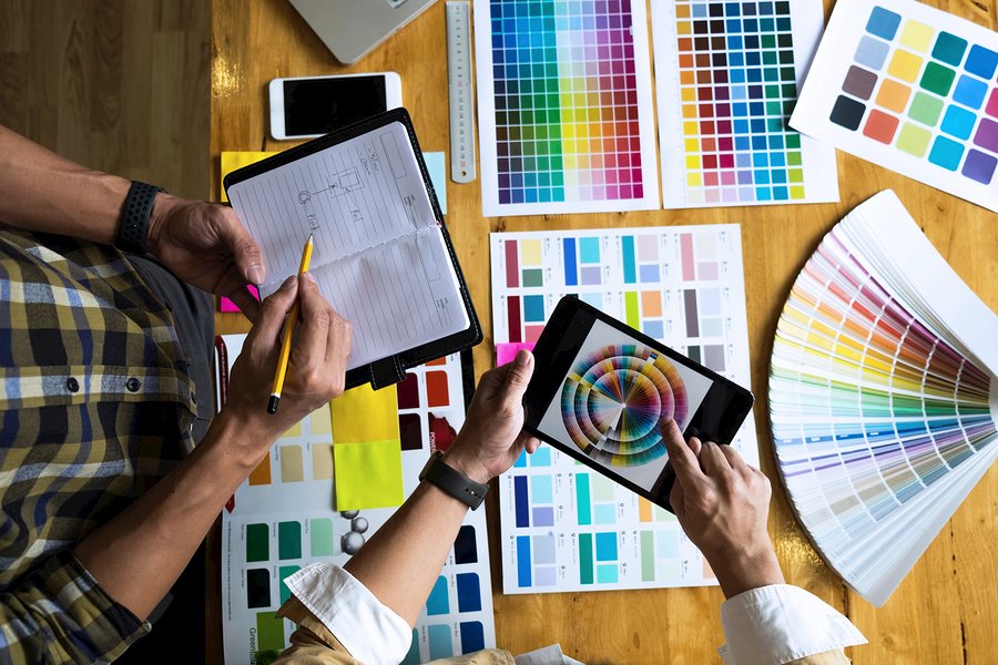
Colors
Colors are an important design element, and strong, bold color schemes are featured on many websites. The use of two colors (duotone schemes) that directly complement one another are popular.
Jarring color combos can create some striking effects, but this doesn’t always appeal to viewers who may find them disturbing.
Motion and interactivity
Websites are increasingly not only offering information but making it move and allowing you to interact with it.
Even a subtle animation or highlighting a ‘current’ line of text can focus your attention on the right spot at the right time. This makes sure you don’t miss important copy or a form that drives conversions. Various creative solutions are being tried out to help viewers navigate a site.
Concluding thoughts
Technological advances are inspiring huge leaps in how website content is being presented and consumed. The days of a static website are long gone.
Accessing websites from mobile devices has changed the way they are designed with the challenge of finding a balance between technological specification and aesthetics. Interactivity, personalized content, live video and more are enhancing user experience.