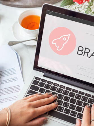
Basically, the term ‘hero image’ refers to a large banner image or video that’s placed front and center on the home page. It’s like an introduction to the site, giving some idea of what to expect.
It’s not just an image but an image with a purpose – it should complement your value proposition and give context and clarity to your visitors the minute they come to your site. It takes about 0.05 seconds for visitors to form an impression of your website, and you want it to be a good one. A study by Google well supports this theory.
How to choose your image
As a marketer, you need to know the reason for every element you use on your website. When choosing a hero image, it’s about far more than just choosing the right colors and fonts – it’s about your work and how you present it to the world.
Your website and its hero image must stay true to your brand and yourself. Angie Schottmuller created a 7-step framework for judging hero images. Ask yourself the following questions.
Does your hero image:
- Compliment your targeted keywords?
- Make your purpose clear?
- Fit with your website design?
- Authentically represent your brand?
- Demonstrate benefits?
- Convey emotions that trigger actions?
- Show your customer as the ‘hero’?
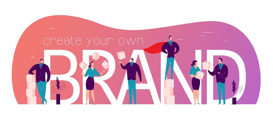
Striking examples to inspire you
The images you use can be photos, graphic elements, illustrations or even short videos. Website navigation links may be found on top of the image or in a solid-colored navigation bar.
Many hero images add call-to-action such as a ‘click for more” button. Paul Jarvis has created a simple hero image on his website with the focus on the email subscription box. He invites people to “hop on” his list, and he’ll send them a newsletter once a week where he documents how he creates products and gives opinions.
Action and motion
Images of humans usually draw more attention, so many companies show their products on real humans in contextual environments.

Bonobos sells swim trunks, and instead of showing a close up of the product, you see men wearing the trunks doing cannonballs into the water.
P&Co follows the same idea with an image slideshow as a hero image showing how the clothes look on models in a free, youthful atmosphere with the text “Home of The Wild Ones.”
Fireworx marketing team use a dynamic and action-packed photo of men in suits playing with colorful fireworks. They include the text “Think. Feel. Respond” on the photo.
Enticing product photos
British research states that almost 94% impressions are design related and only 6% are actual content related. An impression that can be created by a good product image might not be the case even if the description is very good.
When a product is well-known, or when visitors know exactly why they have come to your site, a product image can show off a top-selling product or a product feature, this is useful especially in eCommerce websites like product images in Shopify. Apple’s site features a black background with beautiful photos of the iPhone X.
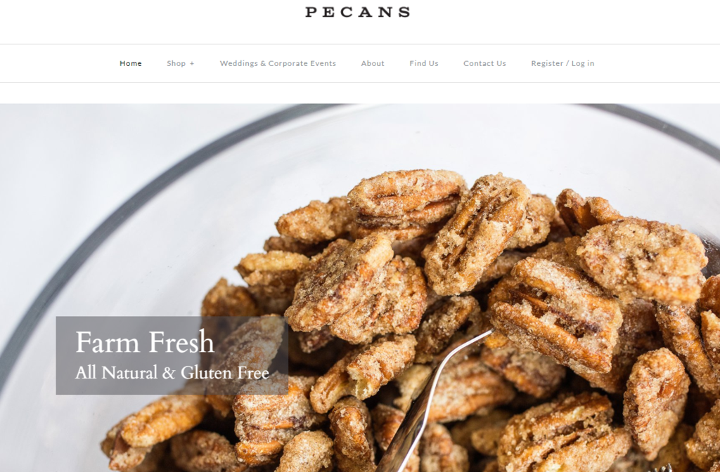
When selling food products, full-screen enticing images of the product is one of the best ways to draw visitors in. Molly & Me Pecans includes a full-screen image of pecans with a big heading and a button which inspires you to click it.
People expect to see food photos when they land on a restaurant homepage. It should give an idea of the type of food and how it’s served. Pastini does this well with the photo of its five-layer lasagna and the text “Layers of Comfort Food”.
Stunning typography
Using the right typography can make your hero image really stand out. A large brightly colored font doesn’t necessarily overpower the image or fade into the background if it is placed correctly. You should never place text over a busy part of an image.
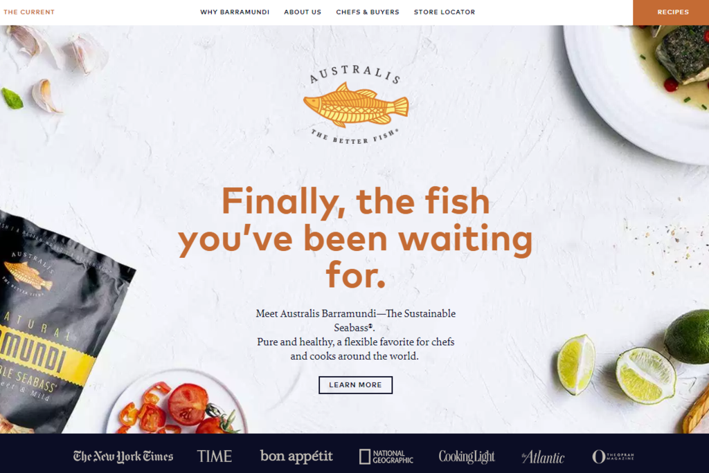
The text on a hero image has to be easy to read. It is more legible when there’s a strong contrast between the background color and the color of the text. A good example of contrast is white on a black background. The Better Fish uses a white background with dark orange text. Apple uses a black background to make its product and text stand out.
Change the color of a single word or part of a headline, and you break the visual pattern, making your text stand out. Paper Tiger uses this tactic by using white and red text against a black background.
Illustrations (static and animated)
Illustrations have become increasingly popular as hero images. The August Digital Marketing Agency uses a custom illustration, demonstrating value by incorporating what they do directly into their hero image with a button you can click to view a case study.
Instapaper has an animated graphic of a desktop computer turning into a smartphone and back. It emphasizes the fact that you can save information and read it anywhere, anytime.
Lunarbot Studios is a creative design agency that uses an illustration of a robot character which fits its brand well.

Heap Analytics uses animated graphics of the charts and reports you can access in their app.
Digital products and software
If you’re promoting a digital product, whether it’s an app or a piece of software, you can make a mockup and pair it with a clean typography, simple description and a link for a stylish hero image. The app Pomodrone by ManyManyPixels is a crisp, clean example of this. Ridetap is another company that follows this approach – the app shows icons of all the ride options, so you know immediately what the app does.
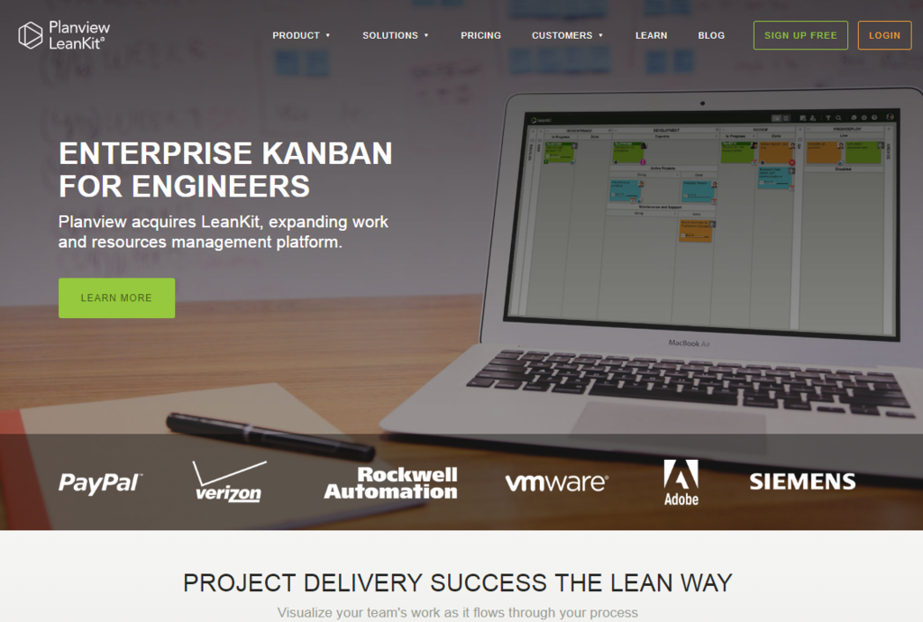
The LeanKit website shows a photo promoting the actual software on a laptop screen. Technology sells based on what it does. If you show users what they get from the platform, they’ll respond more than if you use a generic hardware photo.
A smiling face
An eye-tracking study found that users take only 2.6 seconds to spot the most eye-catching area of a website that greatly influences their impression. A good, positive, and a smiling image might just do the trick. Let’s explore how.
A face draws attention and immediately creates more trust. If it’s a smiling one, you feel positive when you look at it. That said, you should avoid generic-looking people smiling for no reason like many images you can find in stock photo websites. This is so canned and obvious that it will make people distrust your site.
Reminder Media is a website that manages to use a smiling woman effectively. The wording accompanying this is “Marketing beautifully. Generate more referrals with a stunning personally branded magazine”, and you can click a button to receive a sample.
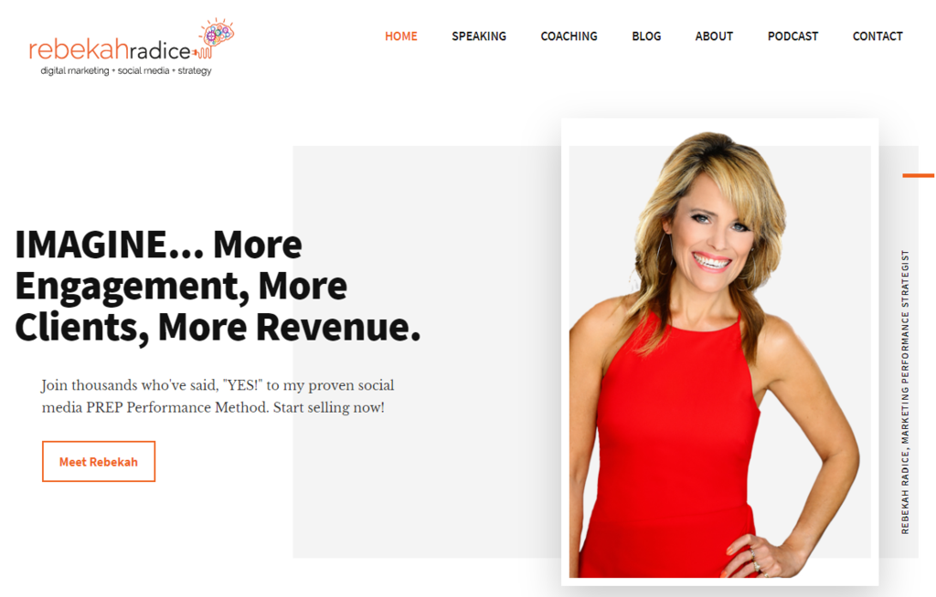
When we go to the websites of many marketing experts, we see a photograph of the founder used as the hero image. Rebeka Radice, a speaker, author and social media specialist has a smiling photo on her website with the message “Creatively build your online brand”.
On Pat Flynn’s website, we see an image of him dressed in a smart suit, smiling and with his arms folded. Brian Dean of Backlinko has a similar image of himself smiling with his arms folded. Men with folded arms tend to convey authority.
A compelling video
When you go to Neil Patel’s home page, which is all about earning money from marketing, you will see a video where he invites you to learn about how to do real marketing. The freeze frame on Neil works to the same effect as a photo.
The same strategy is used by Tucker Max of Book In A Box and Danny Iny of Mirasee, a coaching company. These videos immediately get viewers to take action, see the person’s expertise and how they can help viewers.
Ditto Residential, a property development company, uses full-width video clips with a header, “Building places that inspire”. The clips show contented people in home and office spaces. They allow visitors to imagine what it would be like to live or work in properties like this.
A rotating gallery
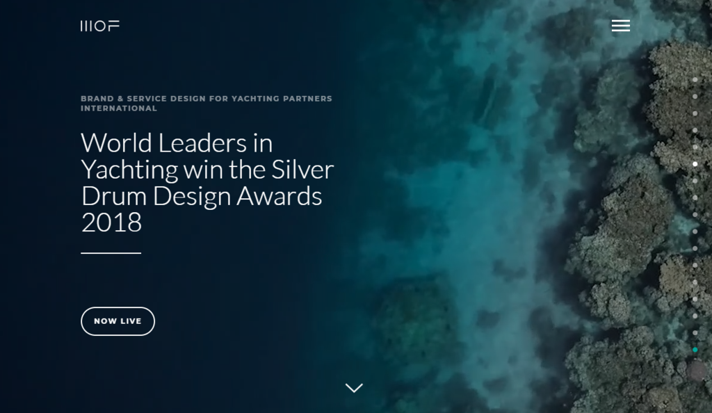
Branding agency, Matter of Form, have a fullscreen display image and viewers can switch between different pieces of content. It is an example of how a photo gallery for your website can be insightful, intriguing and gives a deeper look into the purpose of the company.
Interactive carousel
As soon as you land on Surfrider Foundation’s website, the interactive carousel introduces you to the mission statement of the Foundation, activities, and news. You find out that this site is dedicated to the protection of the world’s oceans and beaches through the use of large, beautiful photos.
Social proof
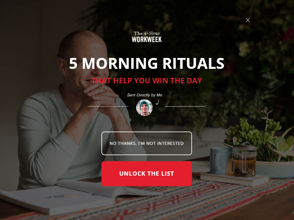
Using social proof on your hero image such as websites you are featured on, client testimonials or companies who buy your products can help you to earn trust. Tim Ferris is the person behind “The 4-Hour Work Week”, and his image on the home page of his website shows social proof from websites like Men’s Journal, the New York Times and Wired.
Conclusion
The large hero images common today were not that popular at first. Many people questioned whether the visitors to the website would scroll past the large image. Now it’s evident that this is not the case and by following current trends, you should be able to create a hero image suitable for your website. By looking at examples of popular hero images, you can start seeing why they work and what will work best for your website. A hero photo will define your brand, so you need to make sure to choose the right one. It should offer the feeling or emotion that best reflects your website and conveys your mission.